US
US UK
UK IN
IN1. Brand Logo
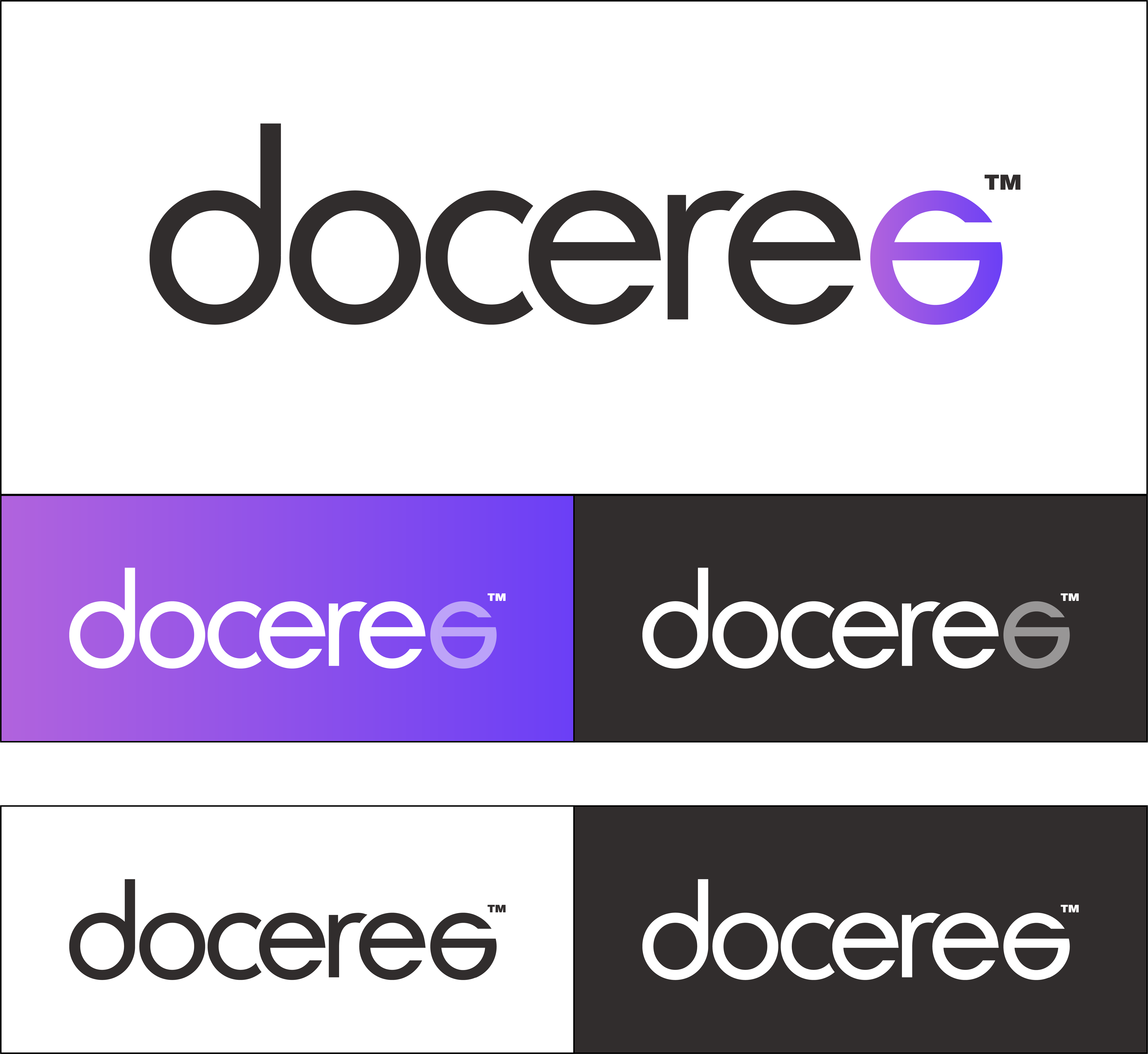
The two color “unlock logo” with the tagline is the primary logo for doceree. On darker backgrounds or images, the logo may be converted to its one-color form with the “unlock e” at 50% opacity. Only in cases where the opacity change is not possible (one-color prints etc), the logo may be converted to a single color variant.
2. Logo Usage

3. Cobranding
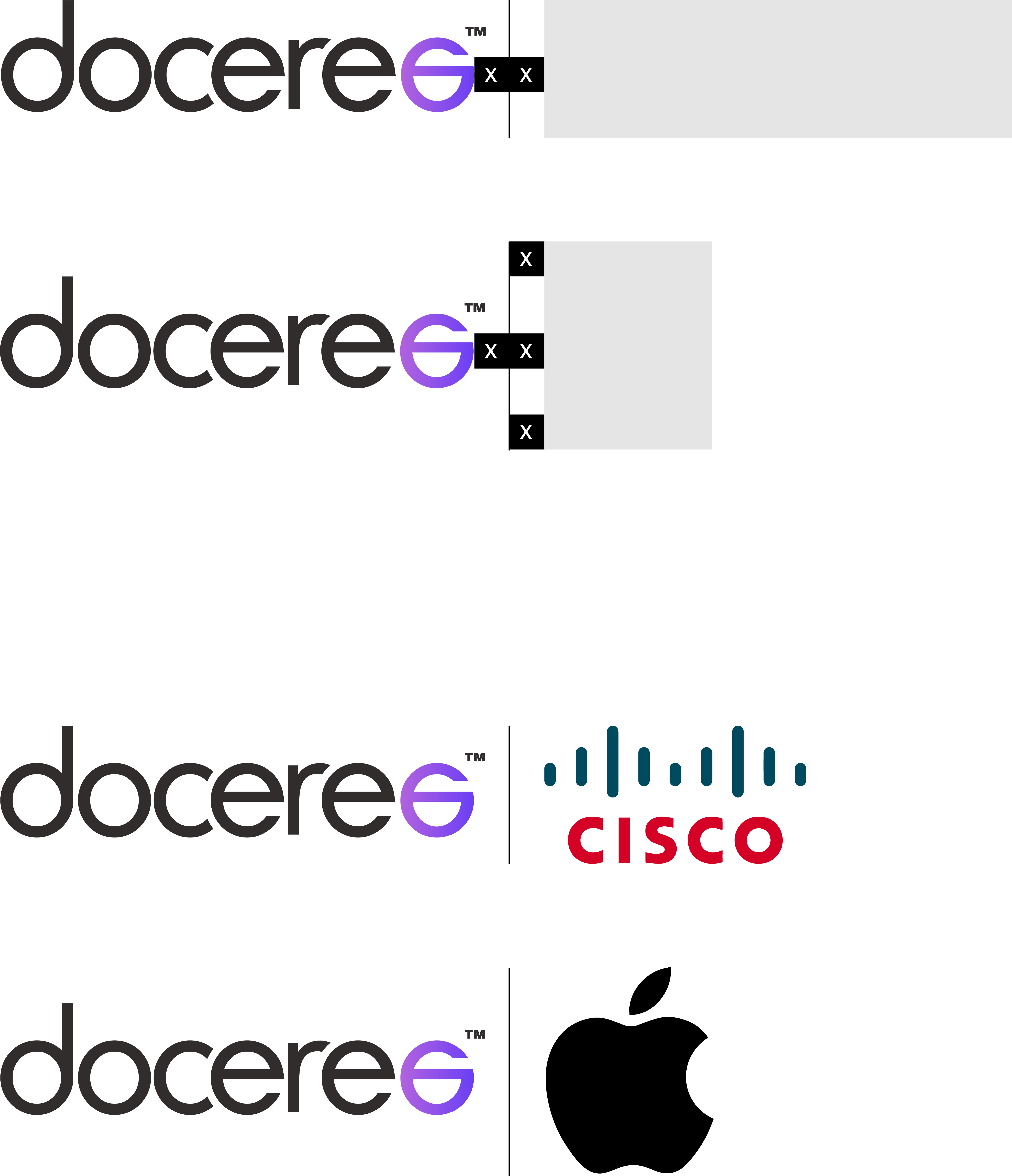
When featuring partner logos in conjunction with the doceree logo, it’s important to make sure they don’t compete visually. To avoid this, use a divider to separate the two logos and create reasonable spacing around both. Fix the height of horizontal partner logos to equal that of the Doceree logo. Fix the height of vertical partner logos to the height of the Doceree plus 2X.

4. Brand Tone & Manner
Doceree is a young brand that is technologically savvy, yet comes from a place of knowledge and expertise. The brand tone is conversational, backed by facts. We do not need to be overly scientific or academic. At the same time, the tone cannot be frivolous or jestful. The intended outcome is for our user to connect with us and respect our expertise.

5. Brand Colors
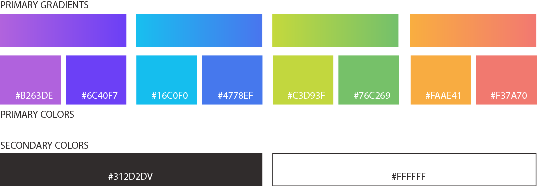
When using the brand colors in creatives and collaterals, always use the gradients. Only use the colors when gradients cannot be used in the medium. Build the creative from white, leaving enough whitespace to highlight the color elements.
6. Brand Font
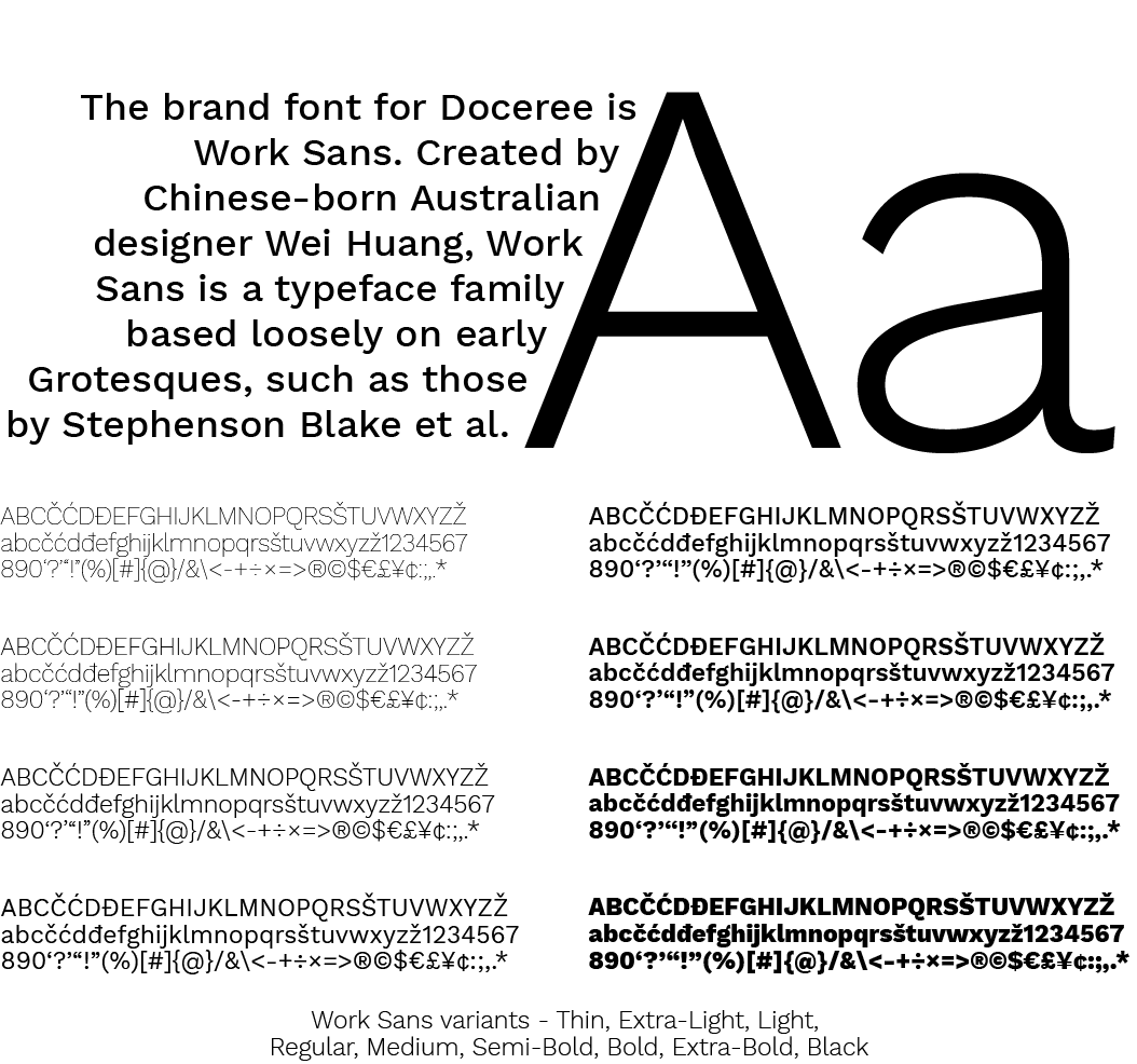
The brand font for Doceree is Work Sans. Created by Chinese-born Australian designer Wei Huang, Work Sans is a typerface family based loosely on early Sans is a typeface family based loosely on early Grotesques, such as those by Stephenson Blake et al.
7. Key Element
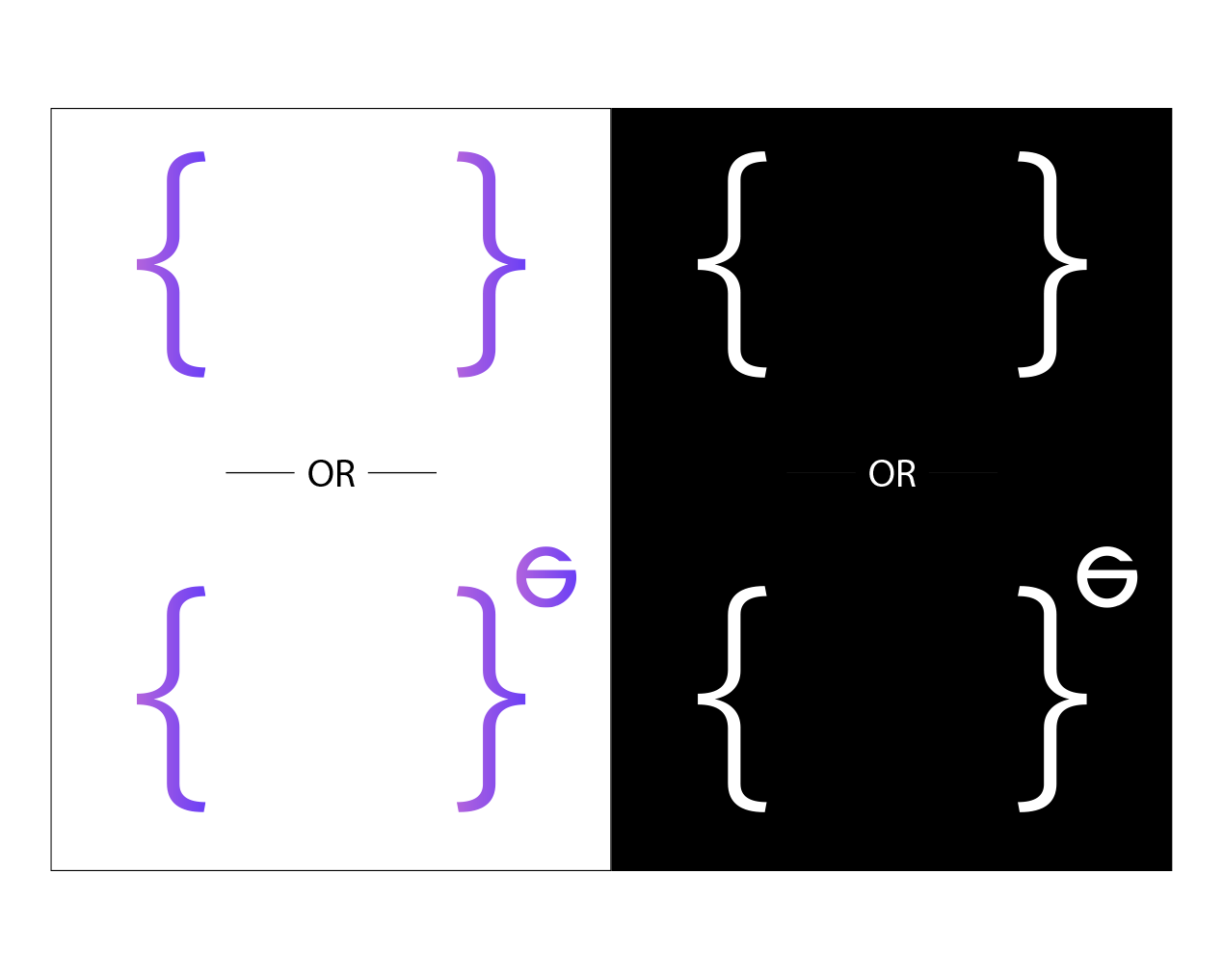
When designing collaterals for Doceree, they should include the key element – the { } – which can be used with or without the “unlock e”. The element can be used in the purple gradient or white (no other color).
8. Photography
The photographs we use in our communication play an important role in setting the tone of the communication. It’s important for us to display genuine moments so that our users trust what we say, who we are, and know they can rely on us to carry out our promises. The key points to keep in mind when choosing a photograph are: People focussed – Ensure that there is always a person or a human element in the frame. Relatable – Use photographs that mirror real life for our target audience. Do not use heavily edited or Photoshopped images. Narrative – Use photographs that tell a story about the people in them.


9. Illustration Style
We use illustrations to enhance our communication and add an element of playfulness to it. Illustrations should complement your message, not compete with it. We use the colours for illustrations and leverage the shades to create a sense of depth. Primary gradients may be used to highlight important elements only in the foreground of the illustration. Depth may be foregone for smaller illustrations. We avoid adding too much detail into the illustrations to keep a simple, uncluttered look.

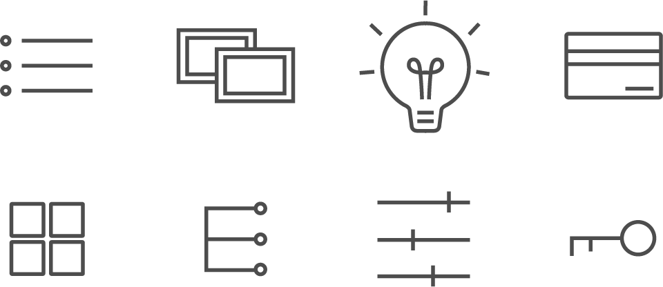
10. Iconography
We use icons to add a visual element and to make communication easier to consume. We use a single colour line based icons as a part of communication.